N16 Color Shades. A Survey 1912-24
-
- Posts: 57
- Joined: Fri Aug 10, 2007 6:00 pm
N16 Color Shades. A Survey 1912-24
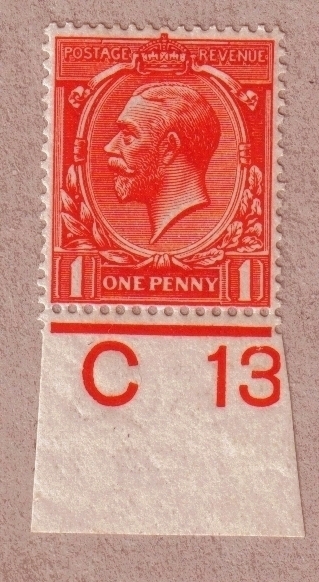
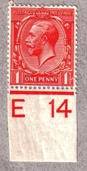
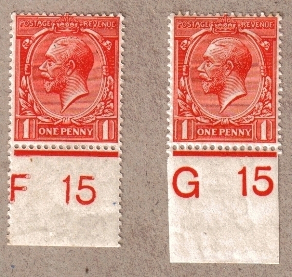
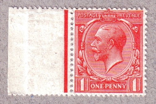
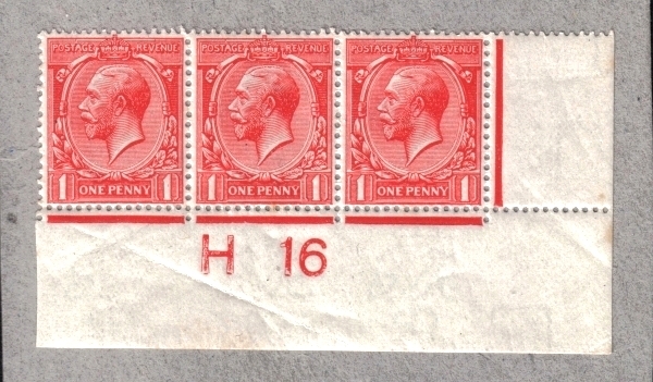
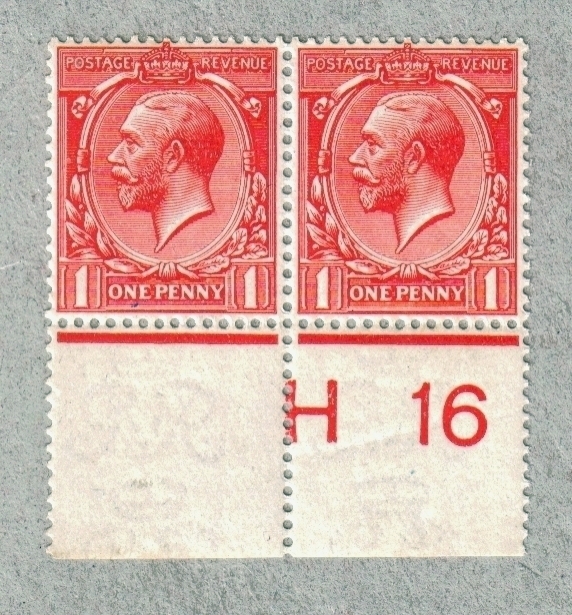
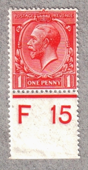
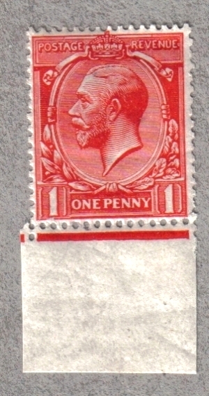
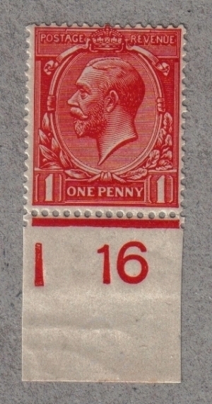
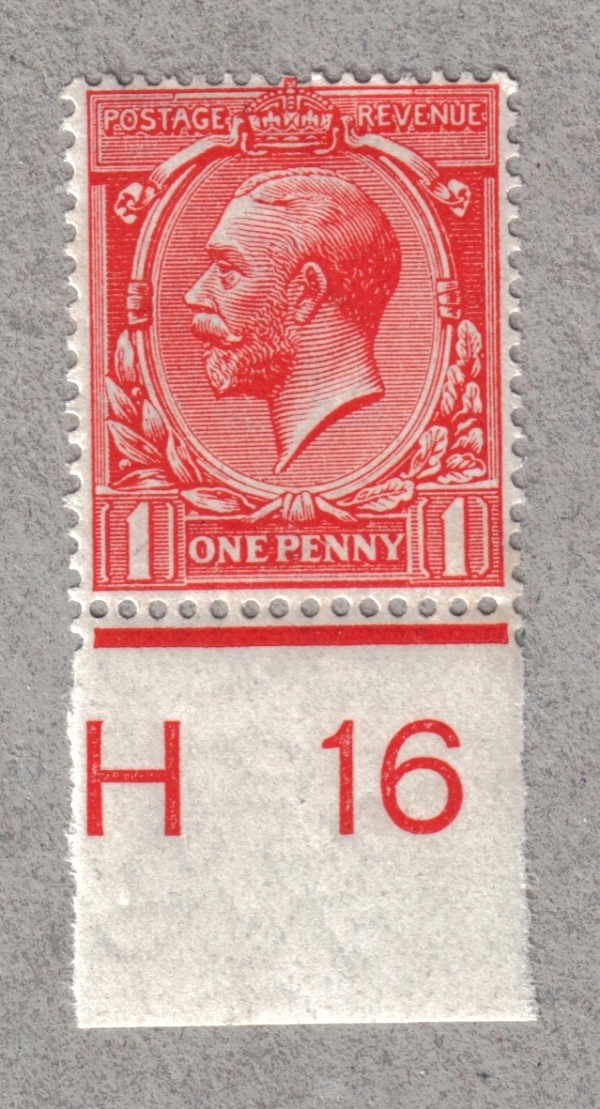
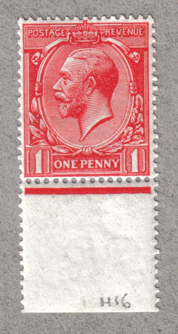
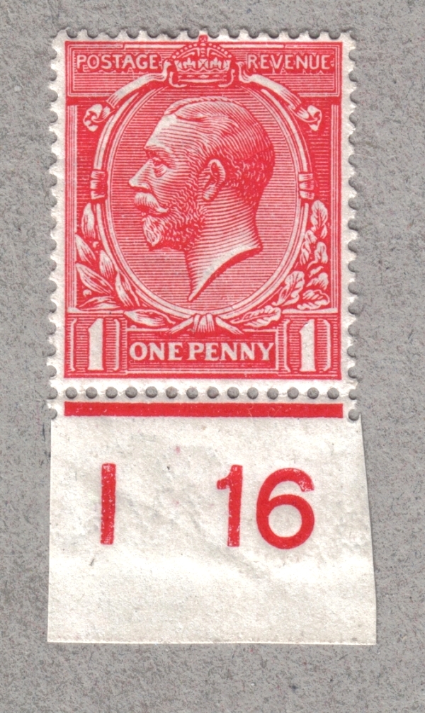
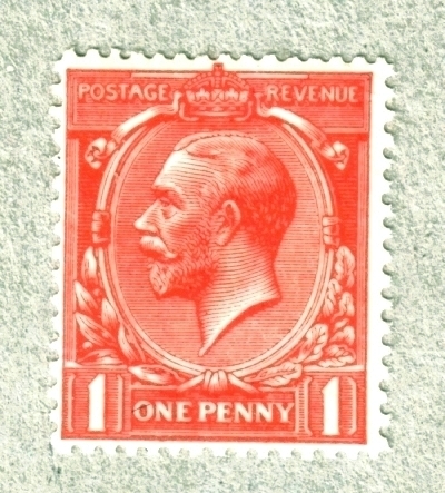
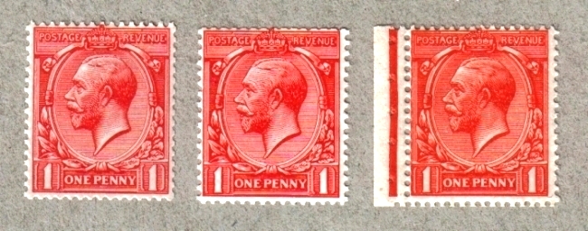
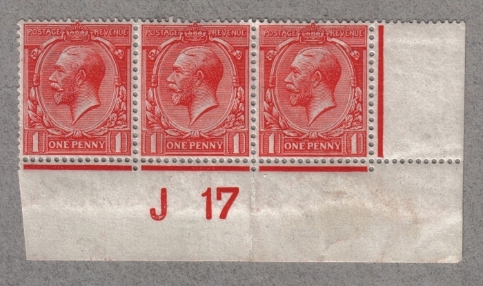
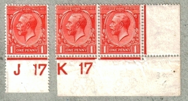
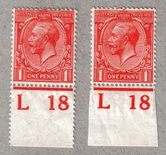
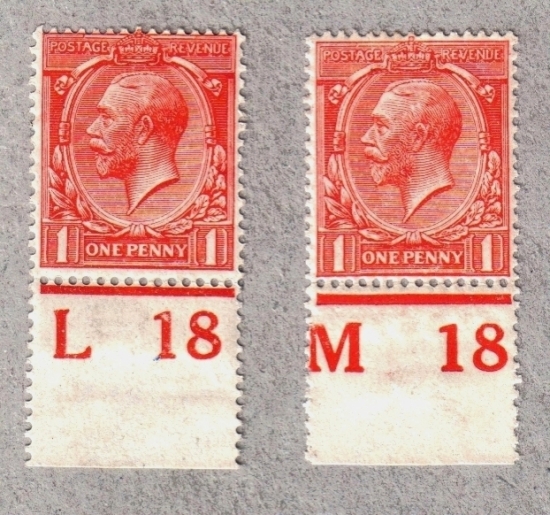
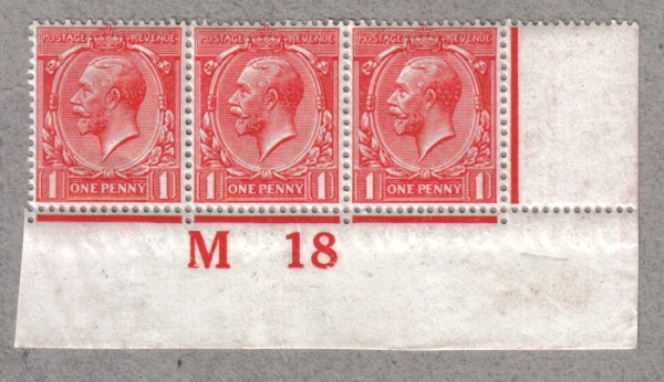
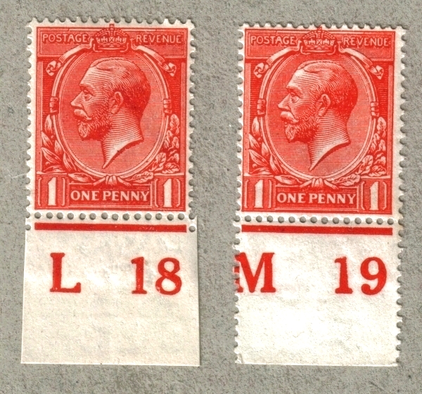
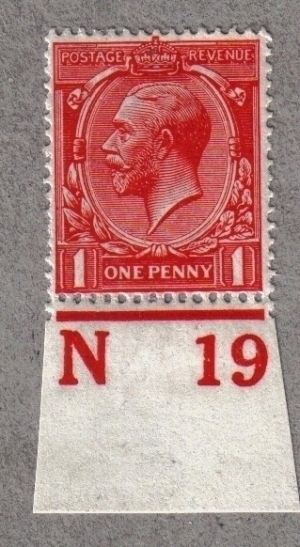
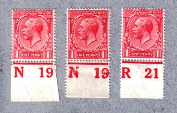
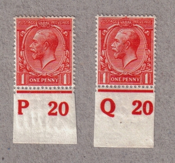
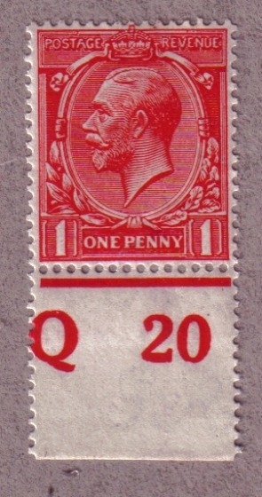
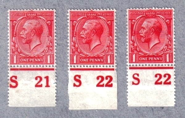
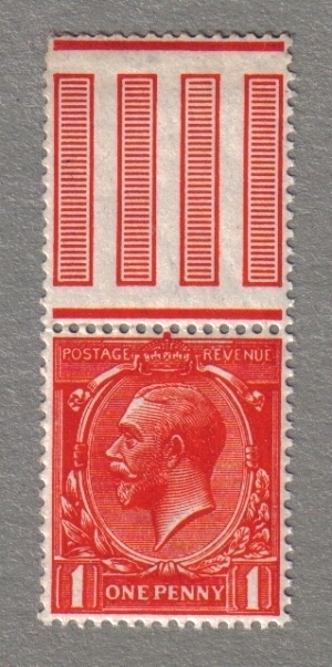
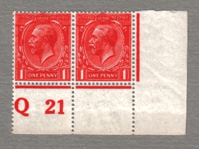
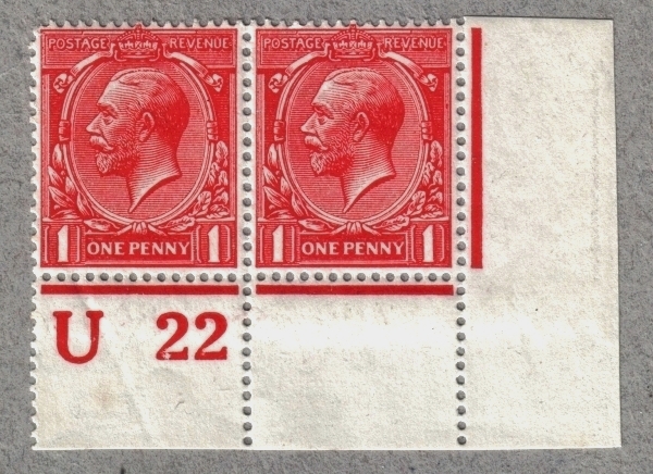
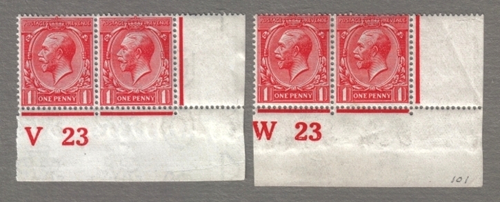
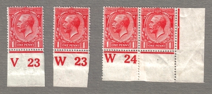
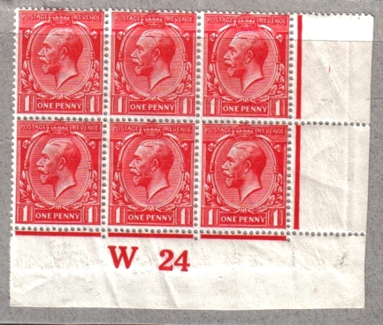
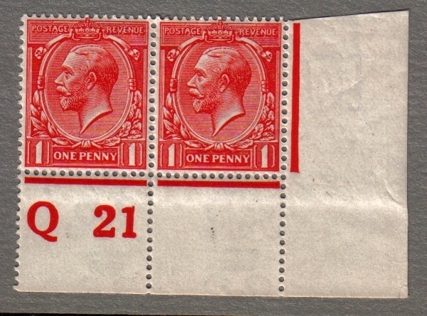
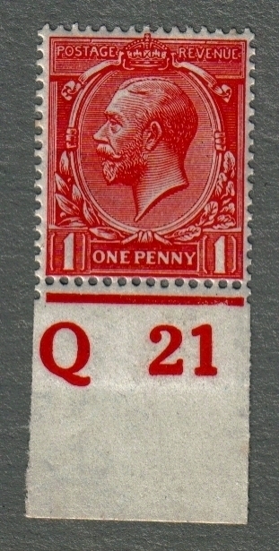
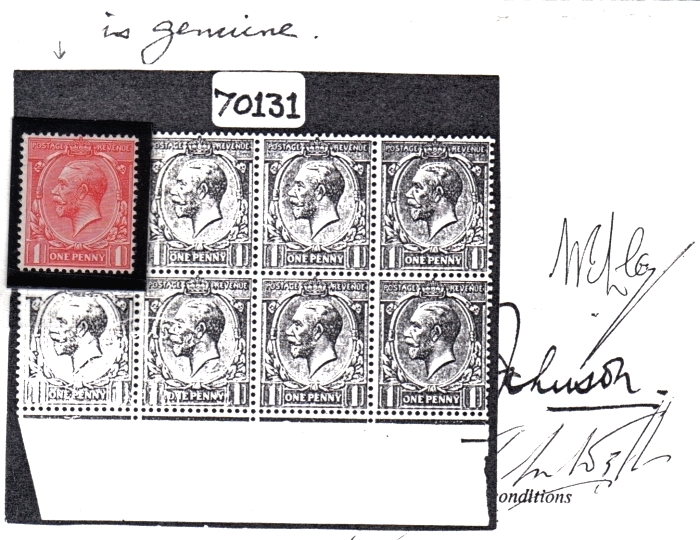
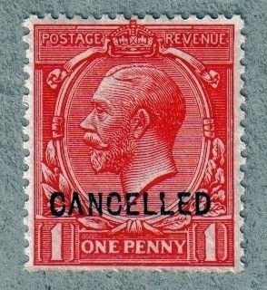
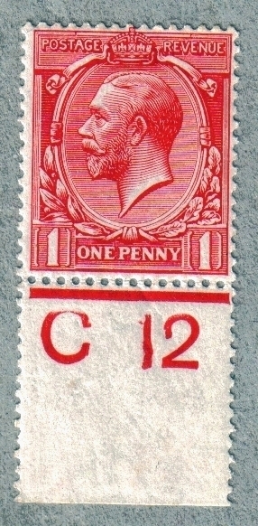
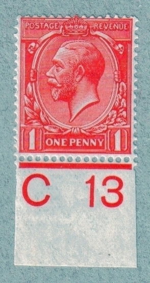
Here shown are examples of Color shades from the 1d. value. The Illustrations are taken from my Reference Collection and progress to the end of the issue in 1924. The intention is to show a story of color prodution before, during and after The Great War and how Harrison Printers coped with producing the correct or as near to the adopted shade of scarlet. Most of the images have the all important Control attached which gives a pinpoint reference to the time at press. As the issue progressed, so the story unfolds.
-
- Posts: 57
- Joined: Fri Aug 10, 2007 6:00 pm
Transfer from previous board: original post 39
An example of the Accepted color for the 1d. value overprinted CANCELLED Type 24.
Scarlet as issued 1912. Bright Scarlet 1913.
Scarlet - Vermilion Deep shade 1913 Listed for that year.
Deep Bright Scarlet 1914.
Vermilion shades first appeared circa 1915.
-
- Posts: 57
- Joined: Fri Aug 10, 2007 6:00 pm
Transfer from previous board: original post 40
Pale Rose Red. True color as listed. Left marginal example circa 1916.
Pale Rose Red in Multiple 1916.
Rose Red Deep shade Unlisted. 1916
-
- Posts: 57
- Joined: Fri Aug 10, 2007 6:00 pm
Transfer from previous board: original post 76
From 1915 and into 1916 maintaining the adopted shade of scarlet was the exception rather than the norm.
Examples from this period are,
Bright Scarlet Pale shade 1915.
Deep Scarlet marginal circa 1915 from a control G15 strip.
Deep Scarlet printed on semi - toned paper 1916.
This shade deeper than N16.4
-
- Posts: 57
- Joined: Fri Aug 10, 2007 6:00 pm
Transfer from previous board: original post 77
During 1916 sevaral Rose Red shade varieties were released on sale for the 1d. value.
Three shade variations are shown.
Deep Rose Red.
Rose Red Deep Bright shade.
Pale Rose Red Bright shade printed under I16 the last control for 1916.
-
- Posts: 57
- Joined: Fri Aug 10, 2007 6:00 pm
Transfer from previous board: original post 78
N16.10 Pink Deep shade. Unlistd. Taken from an I16 control block of four.
Generally, the poor centring of this shade is common from lower right to lower left. This example being centred to the lower left.
A trio of shades from booklet issues.
Bright Scarlet. Deep Brick Red and Scarlet - Vermilion all having Watermark Inverted variety.
-
- Posts: 57
- Joined: Fri Aug 10, 2007 6:00 pm
Transfer from previous board: original post 79
An Example of Brick Red Pale shade from 1917.
Further Brick Red shades from 1917.
Vermilion shades printed under control K17 and verified as printed on plate 72.
-
- Posts: 57
- Joined: Fri Aug 10, 2007 6:00 pm
Transfer from previous board: original post 80
Vermilion Pale shades 1918.
Vermilion Pale to Very pale Vermilion. the latter being a worn Impression plate unknown. 1918.
By contrast the listed Pale Red shade N16.8. This strip of three printed under control M18 for 1918.
-
- Posts: 57
- Joined: Fri Aug 10, 2007 6:00 pm
Transfer from previous board: original post 81
A Scarlet - Vermilion duo from 1918 - 1919.
A superb shade of Deep Scarlet of Intense color printed unusually on better quality paper for 1919.
During 1919 the Carmine - Red shades appeared. The left stamp is in a Pale shade with standard shades as comparisons. 1919 - 1921.
-
- Posts: 57
- Joined: Fri Aug 10, 2007 6:00 pm
Transfer from previous board: original post 82
Shade Contrasts during 1920 through 1922.
Brick Red shades.
Carmine - Red.
Pale Carmine - Red again appearing in 1921.
Bright Carmine - Red. Listed shade together with Bright Carmine - Red an Unlisted shade.
-
- Posts: 57
- Joined: Fri Aug 10, 2007 6:00 pm
Transfer from previous board: original post 83
One of the most outstanding shade varieties produced in this issue was Orange - vermilion. Two examples of this shade are shown.
N16.15 Orange - Vermilion.
N16.16 Deep Orange - Vermilion 1921 and the last listed shade of the series.
Back to basics. Deep Bright Scarlet 1922.
-
- Posts: 57
- Joined: Fri Aug 10, 2007 6:00 pm
Transfer from previous board: original post 84
The final years of the 1d. value color production ended as quietly as it had begun. 1922 - 1924 saw a return to the standard color of scarlet in the main. Shown are some examples of the final printings at Harrisons.
Pale Scarlet shades matching pair from plate 101 printing.
Scarlet shades from 1923 - 1924. Control W24 plate 99.
Deep Bright Scarlet with the final control printing W24.
-
- Posts: 57
- Joined: Fri Aug 10, 2007 6:00 pm
Transfer from previous board: original post 123
Additions to the above shade ranges continue to be added too certain time periods. The amazing contrasts of color shades outside the war years are highlighted from 1921. here two examples of the listed Brick red and Deep Brick red shades are shown in contrast to the deep Orange - vermilion produced in the same year.
-
- Posts: 57
- Joined: Fri Aug 10, 2007 6:00 pm
Transfer from previous board: original post 183
N16.10 Pink from the 1916 printing when in a block of eight. Centred to the right only.
This piece has been plated as coming from Plate 54.
Indent base under On of ONE Row 20 stamp 5 from the 1916 printing B.P.A. Certificate dated 1971.